
Rocks & Wheels
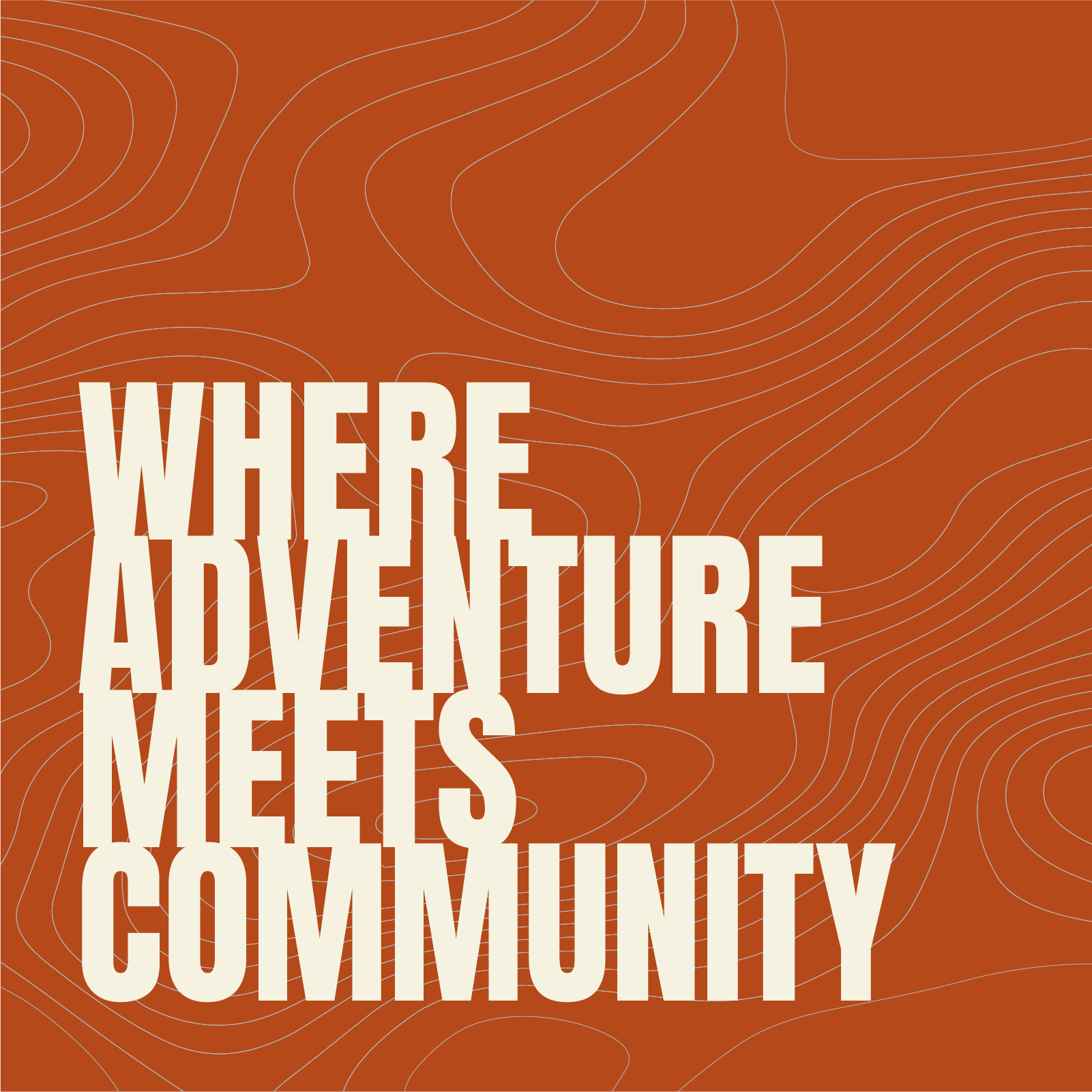
Where adventure meets community
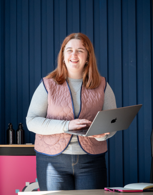
The client
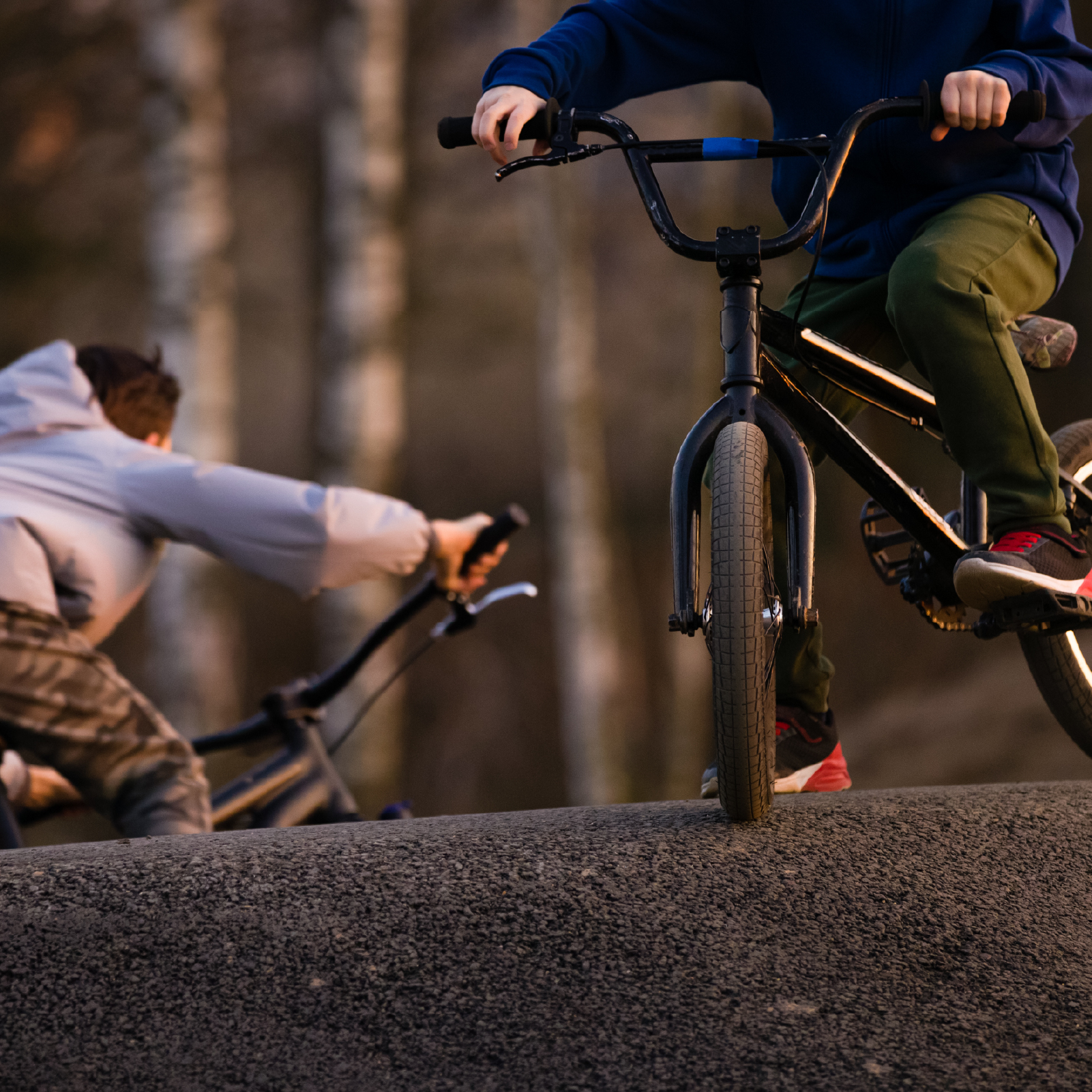
Rocks and Wheels is an adventure sports centre based in Dalbeattie’s former primary school, born out of the Dalbeattie Regeneration Initiative and built around a simple idea: a town famous for its trails deserves a proper home for the people who love them. Cycling, bouldering, outdoor adventure, families, and a bunkhouse all under one roof.
Their ambitions are big. Rocks and Wheels wants to put Dalbeattie on the map as a destination for adventure, and to build something that serves the community around them for the long term.
The challenge
With an offer as wide as Rocks and Wheels’, the brand had to work hard. The risk with a centre that does this much is that you end up saying everything and communicating nothing, trying to speak to the families on their first outdoor adventure and the seasoned trail rider in the same breath, and landing with neither.
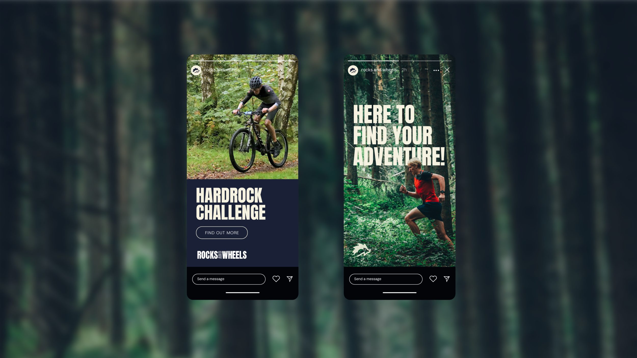
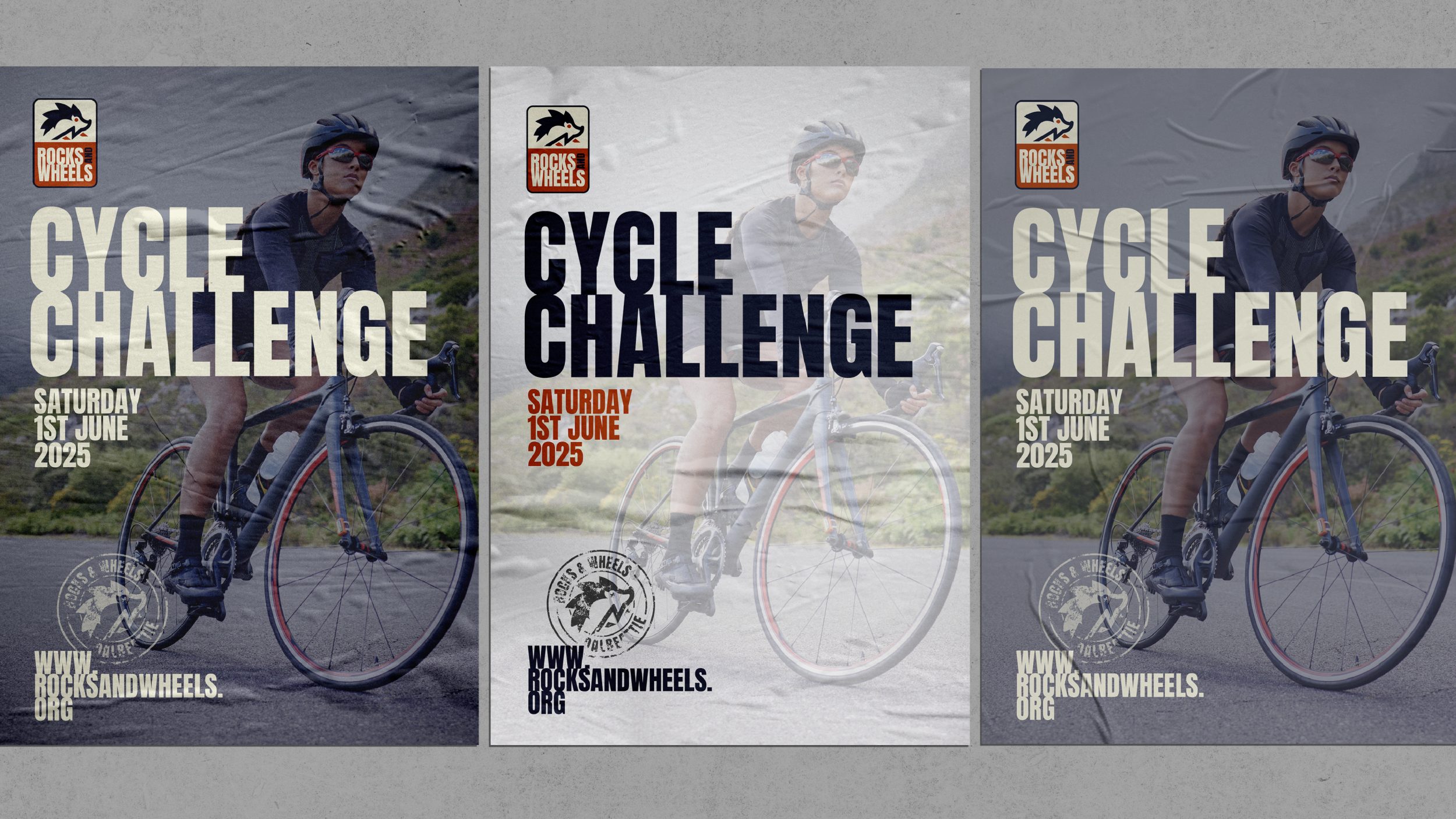
The brand needed to hold everything together without feeling like a compromise. Energetic enough to excite, welcoming enough to reassure, and local enough to feel rooted in Dalbeattie. It also needed to be flexible, working across trail signage, social media, merchandise, the website and the building itself without losing its character along the way.
The result
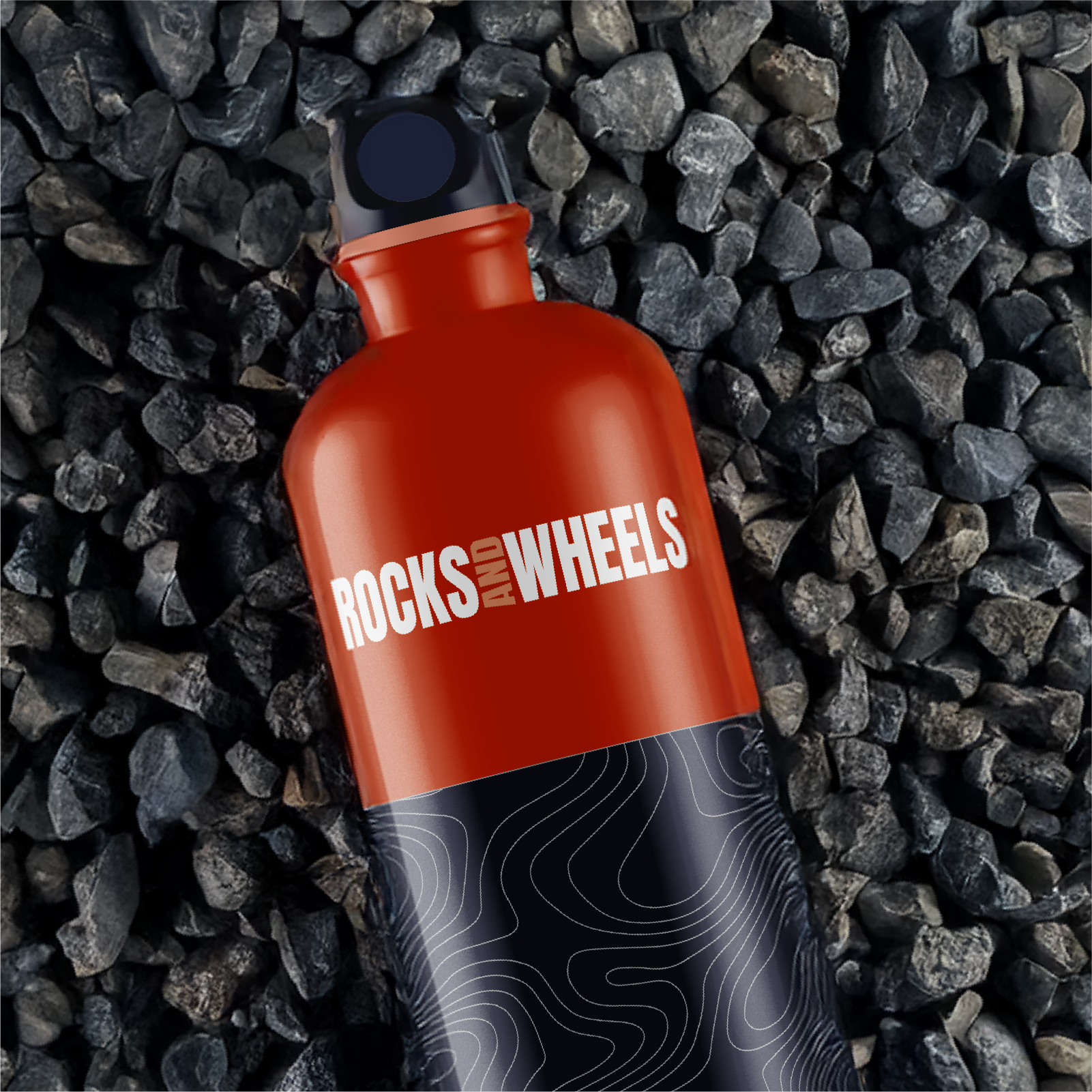
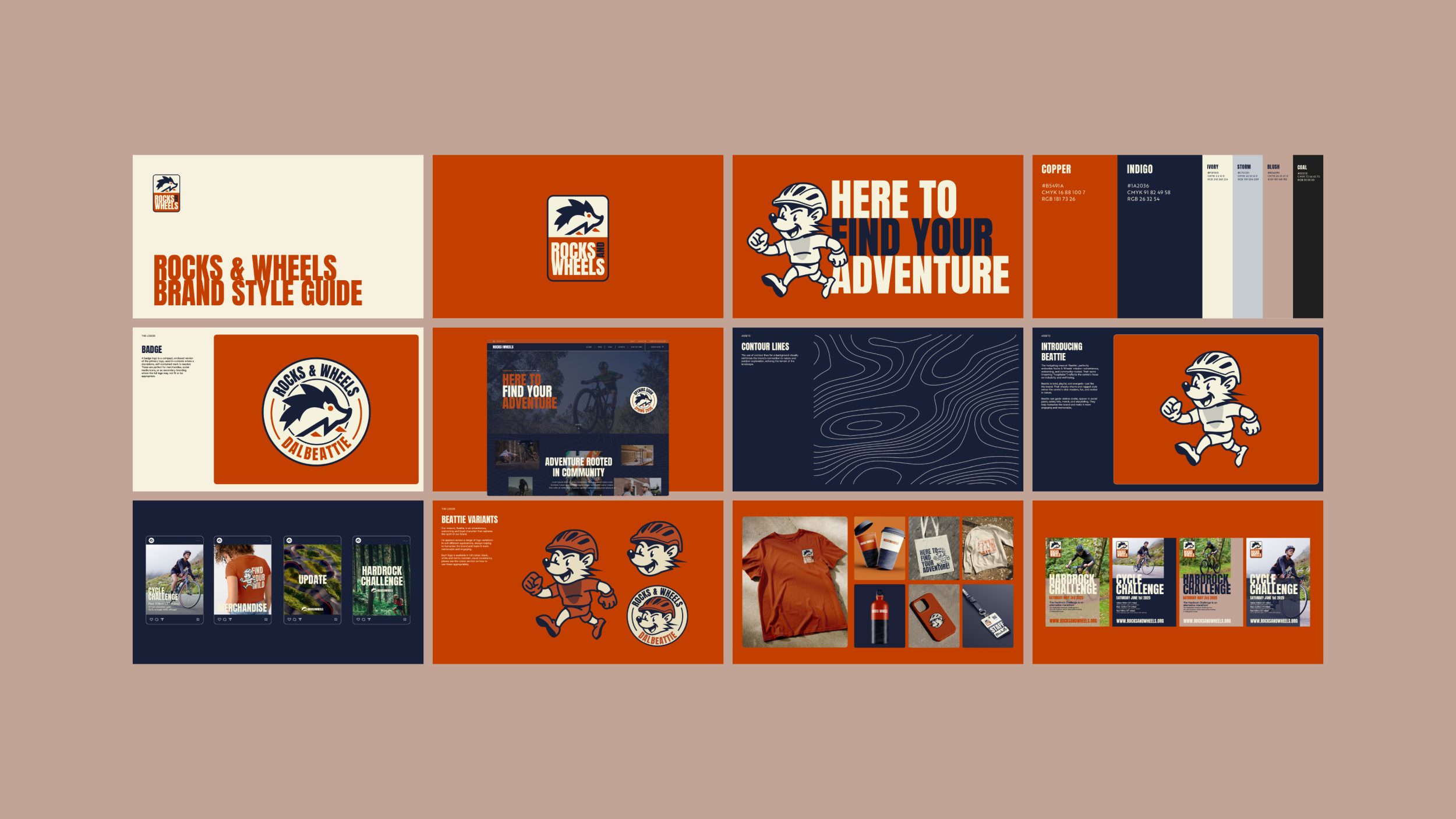
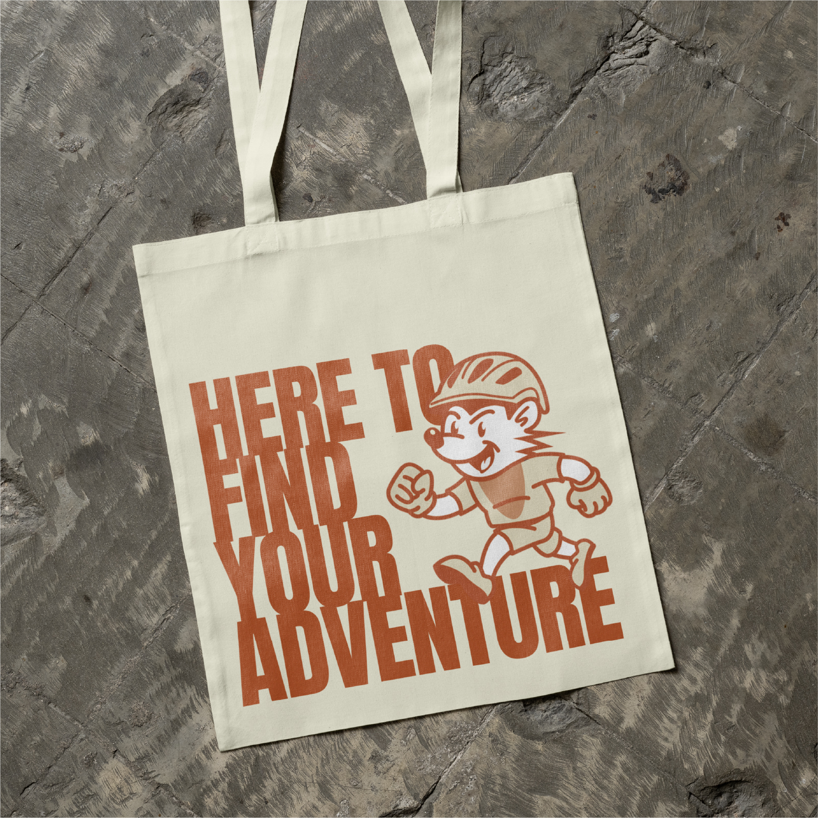
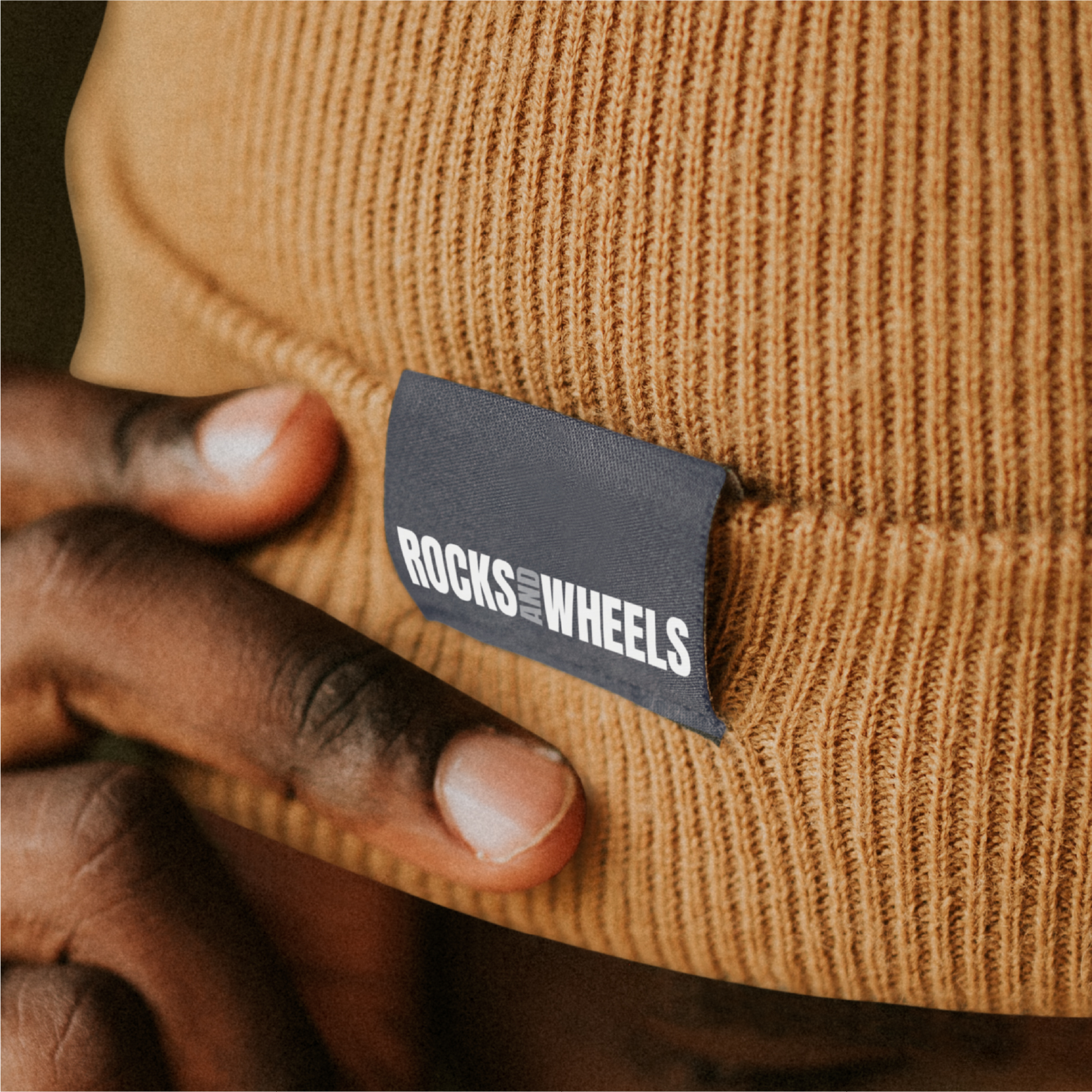
The starting point was already there in Dalbeattie’s own heritage. The hedgehog, a motif from the town’s crest and the symbol used on local trail markers, gave us something to build from. We evolved that into Beattie, a hedgehog mascot whose personality matches the brand perfectly: bold, playful, adventurous and welcoming. Beattie shows up across signage, social media, merchandise and storytelling, giving the brand warmth, and a character that’s hard to manufacture from nothing.
The colour palette reflects the landscape Rocks and Wheels sits within, a rich copper, deep indigo and soft ivory as the primary trio, supported by storm, blush and coal. The contour line backgrounds that run through the brand assets echo the terrain of the surrounding hills and forest, tying the visual identity directly to the place it comes from.
The full brand package gives the team everything they need: a suite of logos for every application, tone of voice guidance built around the idea of the knowledgeable, welcoming trail guide, and a set of flexible design assets ready for real world use. The website brings it all together, giving Rocks and Wheels a digital home that matches the energy of what’s being built on the ground.
Services
Brand & Identity
Sector
Travel / Accommodation
Fancy Something Like This?
If you’re ready for us to bring your ideas to life, we’d love to hear more. Get in touch for a conversation about how we can help with your project.


